(via Houzz)
My problem is, where? I cant decide, so I would like your opinion please! Here are my options. My hallway, left side. I'm not in love with that picture hanging on the wall there. And dont you love all the boxes attached to the wall?
Or right side. I'm not sure I want the shelf here anymore, but I'm not sure. This is also where I think I'm going to put the little sewing machine table.

Or the other option is my living room. This is how the room looks. I'm not sure about these hang prints here. They seem too small, what do you think? (Ive been meaning to blog about these!)

This is the opposite wall from the photo above. (I HATE that light!)

This is looking straight ahead when you walk in. The wall above is to the right, the one with the handprints is to the left.
And here is the opposing wall.
I'm joining the Decorating Dilemma party over at Serenity Now. And I apologize for the poor photo quality. It was getting dark!
So, any suggestions? Where do you think I should start a photo collage? I thought about a photo ledge above the couch and the collage in the hall? Not sure. Please help! :)
I'm joining the Decorating Dilemma party over at Serenity Now. And I apologize for the poor photo quality. It was getting dark!


living room for sure~~
ReplyDeleteWhich wall?
ReplyDeleteI vote the last photo, the ledge above the couch and the wall I believe had handprints next to a sliding glass door maybe??
ReplyDeleteI like the idea of putting the photo wall over the couch. It would be such a great focal point. I also love that wall with the embroidery hoops on it. So cute!
ReplyDeleteXOOX
Jen
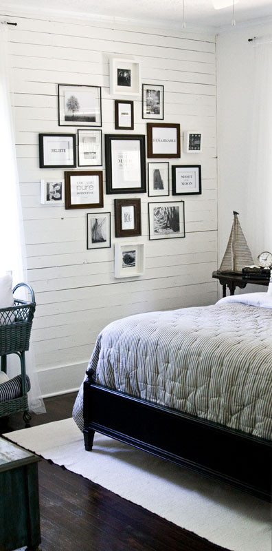
I vote for the wall above the couch. You could buy a bunch of different frames in different sizes like the picture at the top! Good luck, can't wait to see what you do!
ReplyDeleteI think any of the walls you've shown would be a good one, but I vote for the wall above the couch so you can make a focal point. Maybe you could even add in an embroidery hoop or two to carry the theme over a bit and add a little something. ;)
ReplyDeleteOne thing I've learned from reading blogs is that groupings, collages, etc. tend to look better when you have them lower on the wall so they are closer to eye level. Just a thought. :)
Thanks so much for linking up! I hope you have fun visiting around the party. :)
over the couch!
ReplyDeleteI'd go where the hand prints are and move the handprints on top of your table in the hall. I think the lamp will give the pictures a lovely warm glow. My mum put hers on the stairs so it spreads over 2 levels and looks fab.
ReplyDeleteGood luck with your decision :)
I vote over the couch!
ReplyDeleteHmm, I never know where to hang anything so you might want to skip right over this comment but I vote for the living room to the left of the sofa. :)
ReplyDeleteDefinitely not photo one, where the thermostat and fire alarms are.
ReplyDeleteI also tend to think over the couch, but I have a 5 year old and I have to say, are the kids going to jump up and down on the couch and knock the stuff down? Because mine does. LOL
I would add your handprints to your fabric wall, if it matters. Circles + circles.
And then do the collage on the wall with the one mirror and the shelf with the house thing on it. PHoto number 2.
Hi, you don't know me, I was just sailing through blogs and thought I'd give my input :)
ReplyDeleteI think the wall by the TV should be plain because the TV is sort of a centerpiece and when people see that wall, they will look at the TV as opposed to your photo collage. I think you should put it where the shelf is and put the sewing machine under the collage. Then while sewing you could look up and see all of the great memories!
xxxxxxx